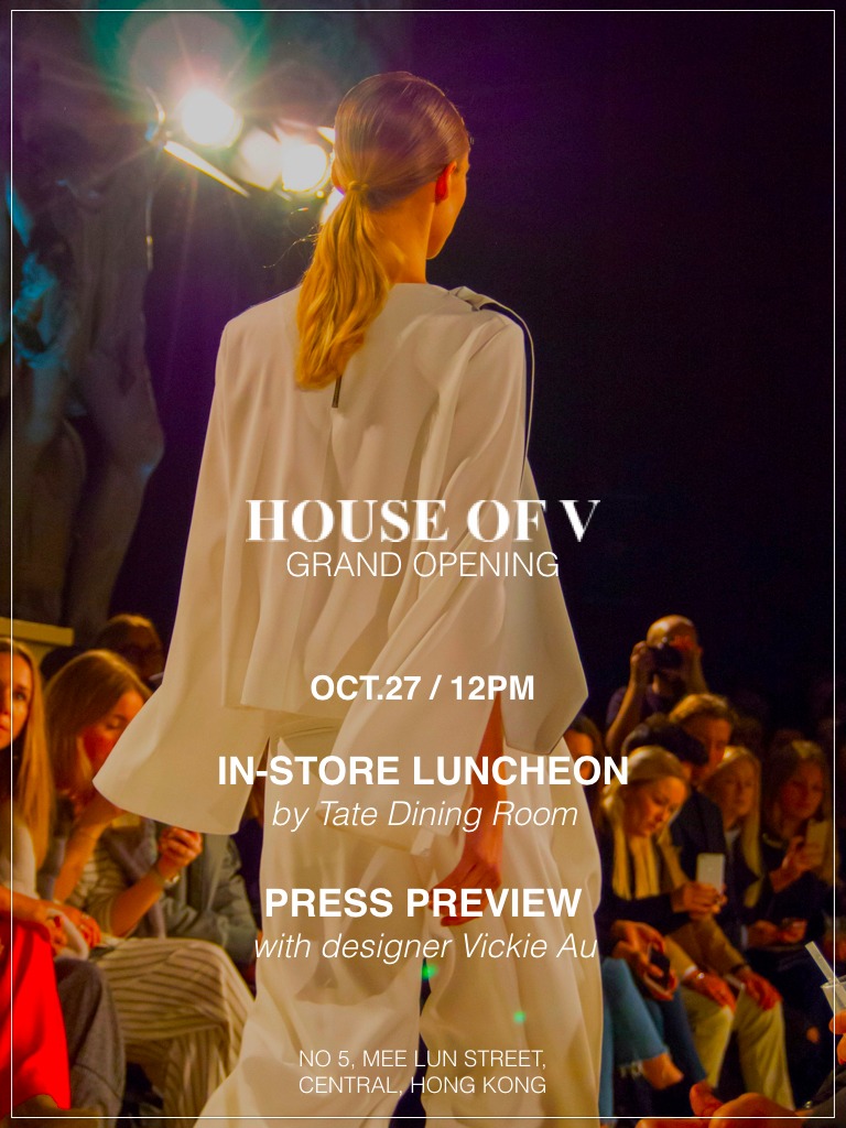
House of V
Lineation is the basic element for creation in the aesthetics of architecture. HOUSE OF V alters the idea into a refined design foundation. Through extraordinary artistic handcrafts, the brand integrates architectural aesthetics with tailoring art. The letter “V” explicitly tells the philosophy of the designers, which uses simple lining to design with depth. More than a brand logo, the letter is also a semiotic sign that coincides with the ubiquitous brand design. It is believed that all the brand supporters are independent and confident.
Press Preview
House of V has relocated their store to Central. To announce the movement, House of V has decided to do a one day event with Press Preview on their Fall Collection along side with the designer Vicky Lau on a sit down in-store luncheon prepared by TATE Dining Room.
Detail 3
The following is placeholder text known as “lorem ipsum,” which is scrambled Latin used by designers to mimic real copy. In sit amet felis malesuada, feugiat purus eget, varius mi. Nullam sit amet nisi condimentum erat iaculis auctor. In sit amet felis malesuada, feugiat purus eget, varius mi. Mauris id fermentum nulla. Mauris egestas at nibh nec finibus.
Detail 4
The following is placeholder text known as “lorem ipsum,” which is scrambled Latin used by designers to mimic real copy. Aenean eu justo sed elit dignissim aliquam. Vivamus sit amet semper lacus, in mollis libero.


